 View interests.html >>> View style.css >>> View index.html >>>
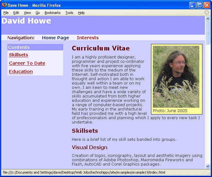
The simplest definition of what constitutes a web site is two or more web document stored together and linked to one another. The example file used to explain the process of building a semantically harmonious web page contained a curriculum vitae and will form the front page, better know as the site index or home page of a website about me. The web site could contain several pages and certainly one of these would contain information about the things that interest me.
 View interests.html >>> View style.css >>> View index.html >>>
The easiest way to create a second document is to make a copy of the first. This document is going to be about my interests so it makes sense to call it interests.html. For the purposes of this excercise store it in the same folder as the index.html file and the style.css file. Store all images you need in this folder too.
In my interests.html file used in this example I have used the same structure as for the index.html and created links again for the subheadings.
The two documents need to be linked together. Common practice for this is to create a navigation bar across the page. This can be done in a semantically harmonious way using another unordered list containing links.
Create a similar nest within a nest pattern of lists as for the side contents list and add it to the end of of both documents just before the end </body> and </html> tags. This item will be positioned absolutely in the browser window so the place in the document source doesn't matter. As more pages are added this section of the code will be the one that is edited each time in every document to provide more links in the navigation bar so keeping it at the bottom of the code just makes things that little bit easier by making it quick to find when editing documents.
Instead of using bookmarks signified by the hash symbol, each <a> link href attribute will be given the name of the file it refers to as a link. Clicking a link with a file name in the href attribute makes the browser window change to and load up the new document.
... <ul id="navigation"> <li> <h1>Navigation:</h1> <ul> <li> <a href="index.html" title="Home Page">Home Page </a> </li> <li> <a href="interests.html" title="Interests">Interests</a> </li> </ul> </li> </ul> </body> </html>
Add in a set of id and contextual selectors for this list to position it absoloutely. On the page just under the pagebanner heading tag. The navigation bar is horizontal so the inline display attribute has been used to over ride the default block behaviour of the list and list item tags I ahe also removed the underline from the link texts in this bar. It is obvious to most users that this bar contains links because this kind of navigation layout is common in look if not structure to the majority of web sites, it is not necessary therefore to use the underline and removing it makes for a cleaner navigation layout.
#navigation { background-color:#EEEEFF; left:0px; position:absolute; top:60px; width:100%; } #navigation, #navigation ul, #navigation li { display:inline; list-style-type:none; margin:0px; padding:0px; font-weight:bold; } #navigation h1 { font-size:14px; display:inline; margin: 0px; padding-left: 20px; } #navigation a { font-size:14px; margin:0px; padding-left: 20px; text-decoration:none; }
 View the home page>>>View the interests page >>> View the style sheet >>>
View the final web site with the navigation bar containing links to each document as a common element of every page. Common navigation and consistent layout throughout a website is good practice and aids the visitor experience..
The Internet has evolved over many years as has the way visitors view pages and sites. The majority of contemporary websites all funtion in a similar way visually and much of the way a page is laid out is common across a multitude of sites. Quite simply humans like things to be familair and as a result there are some common practices when building web sites. Here is my ABC.
The front page of a web site is called the home page, it is common practice to label any links to it on your site as "home". Similarly ' FAQ' (frequently asked questions) , 'contact', 'site map', 'directions' and 'about' all have standardised meanings to the majority of web visitors.
Research has consistently shown that large paragraphs of text don't really work on the mass market Internet. Break your information up into small chunks like this page is. Think journalistically about your content and adopt a similar approach to tabloid newspapers using a heading followed by an eyecatcher paragraph and then, if necessary, the remainder of the article underneath.
It is very off-putting for a visitor to a website if things jump about from page to page, try to keep a consistent layout across your web site. Wherever possible keep navigational elements in the same place on every page and if possible link all pages to one CSS style sheet file for site-wide consistency.
If you followed the sections all the way through from the start and made the examples as you read through then you should now have all the essential skills to build a fairly decent looking website.
You don't need to be able to use graphics software to make colourful web sites
You don't need expensive web creation software to make a well structured web site
A web site is a very basic thing, it can be made in a basic way using basic computer skills and a little bit of craft. Tell all your friends you can build web pages but be wary of calling yourself a web designer just yet. You have the basic skills to build web pages, thre are a lot of tricks and techniques to learn before you can class yourself as a web designer.